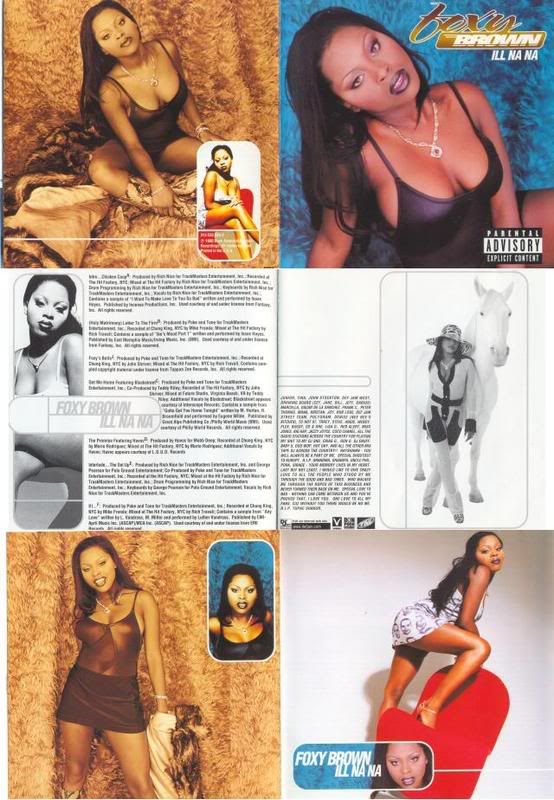
good album, crappy cover!
Back in the ol' '05 and '06, we had "Review Time with Chasing Coolness Funtime Theatre," for the '07, I'm giving you "Good Album, Crappy Cover," in which we take a look at an awesome album with a shitty cover art and liner notes.
For the first in the series, I chose an album that I sought out to get during a snowstorm, Foxy Brown's "Ill Na Na." In early 1996, there was a snowstorm that hit Seattle, which led to my high school's cancelation for a few days. That Tuesday, Brown's debut album had finally come out and I was determined to get it. I weathered three late busses, wet socks and a drenched pair of Pumas before I finally got to the Wherehouse where I got my copy. And that's the story; captivating, isn't it?
 + Foxy in a shiny top.
+ Foxy's boobies hanging out.
+ Foxy's butt in the air.
- Foxy's cross-eyed look on the front cover.
- Foxy walking with a horse? Who the fuck rolls around with horse in Brooklyn?
- Foxy standing in front of a fur wall which looks as though it was pilfered from a drag queen's closet.
+/- The sepia-toned picture in which Foxy looks like she's saying, "YEAH!"
The overall feeling of this artwork conjures up both a feeling of laziness and a lack of budget. Typically, any album by a female rapper that prominently features said rapper's body parts, tend to suck (see: Lil' Kim, Ms. Sancha). The boxes strewn about with Foxy's face smells of MS Paint-styled artwork in which the layout editor at Def Jam started screaming, "BOXES! The future of cover art is BOXES!" Also the title, "Ill Na Na," can be misconstrued as "sick/gross poon."
Labels: Foxy Brown, Good Album Crappy Cover

0 Comments:
Post a Comment
Subscribe to Post Comments [Atom]
<< Home